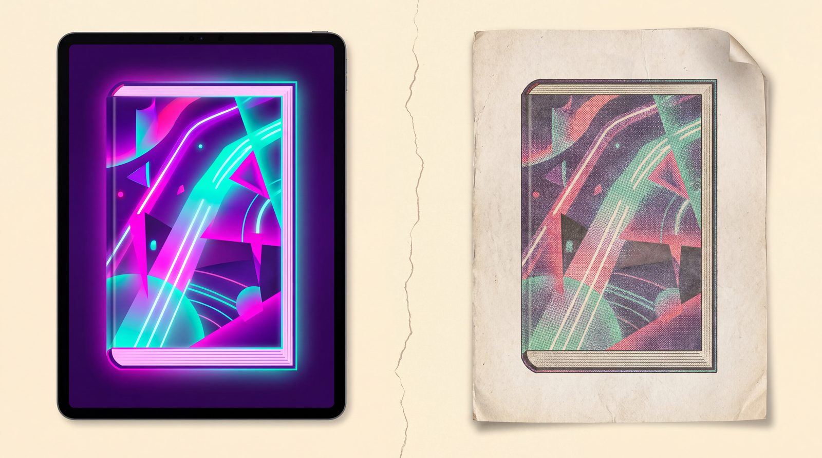
You designed a cover that looks gorgeous on screen. Deep purple background, electric pink title, a glowing teal sigil. You upload it to IngramSpark, order a proof, and the proof arrives looking muddy. The purple is now eggplant. The pink is salmon. The teal is gone entirely.
You didn’t do anything wrong. Your screen and your print press use different color systems and they can’t represent the same colors. Here’s what’s happening and what to do about it.
RGB and CMYK are different alphabets
Your computer screen makes color by emitting light in three colors: red, green, and blue (RGB). When all three are at maximum, you see white. When all three are at zero, you see black. Subtractive combinations make every other color.
A printing press makes color by laying down ink in four colors: cyan, magenta, yellow, and black-key (CMYK). When all four are at zero, you see paper white. When all four are stacked at maximum, you see… well, theoretically pure black, but in practice a wet, smudgy mess that the printer rejects. (See Total Ink Coverage for more on that.)
The problem: screens can display colors that no ink can reproduce. Specifically:
- Bright neon colors (electric pink, fluorescent yellow, cyan-teal): screens make these by maxing out specific RGB combinations. Inks can only mix approximations.
- Pure deep blacks: screens make black by emitting no light. Ink-based blacks always have a slight color cast because the inks aren’t perfect.
- Bright deep purples: the gap between RGB violet and the closest CMYK approximation is one of the largest in the entire color space.
What “out of gamut” means
When a color exists in RGB but cannot be reproduced in CMYK, it’s called “out of gamut.” Print software (Acrobat, Photoshop, Affinity, Ghostscript) handles out-of-gamut colors by clamping them to the nearest in-gamut equivalent.
The clamping is a guess. Different conversion engines guess differently. Adobe’s color management system uses one algorithm; Ghostscript uses another; the IngramSpark print pipeline uses its own. The result is your bright magenta becomes salmon and you have no control over the conversion if you uploaded an RGB file.
Why your printed cover looks different
Three specific things cause the muddy-print effect:
1. Saturation drops
CMYK can’t reach the same saturation as RGB, especially for purple, blue, and bright neon shades. A 100% saturated RGB violet becomes about 65-75% saturated in CMYK. Your eye reads the change as “looks duller.”
2. Hue shifts
Some hues shift entirely. The biggest offenders:
- Bright greens shift toward yellow (because pure CMYK green requires 100% cyan + 100% yellow, which is muddier than pure-light green)
- Pure cyan shifts toward dull teal
- Hot pinks shift toward pinkish-orange
3. Black and dark tones gain a color cast
Pure RGB black becomes a “rich black” in CMYK by default, which mixes all four inks. The mix is rarely perfectly neutral; you’ll see slight green, blue, or red casts depending on the mix used.
The right way to handle it
Three options, ranked from best to worst:
Option 1: Design in CMYK from the start
If you’re using Affinity Publisher, Photoshop, or Adobe InDesign, switch the document to CMYK mode before you start designing. The color picker will only show you in-gamut colors. You’ll never accidentally pick something that won’t print.
The downside: CMYK design feels more limited. You won’t have access to the bright neon shades. Many indie cover designers find this constraining.
Option 2: Design in RGB, convert with control
Design in RGB so you have full creative range, then explicitly convert to CMYK with soft proofing at the end:
- In Photoshop or Affinity Publisher, turn on View → Proof Setup → Working CMYK
- The screen will simulate how the design will look in CMYK
- Adjust any colors that look muddy when proofed
- When you’re happy, do the actual conversion (Image → Mode → CMYK in Photoshop)
The downside: this requires a paid tool ($70 for Affinity Publisher, $240/year for Photoshop).
Option 3: Use a tool that handles CMYK conversion automatically
If you don’t have the budget for a design tool with soft proofing, the next-best option is to design in RGB and use a free tool to convert to CMYK at export time:
- The BookReady cover builder builds your design in RGB at the screen, then converts to CMYK PDF/X-1a using Ghostscript at export. Ghostscript is the same tool real print shops use, so the result matches what IngramSpark would do internally — you just get to see the result before submitting.
- The BookReady PDF scanner does the same conversion for an existing PDF you’ve already designed elsewhere.
The advantage of converting at export time (rather than the printer doing it for you on submission) is that you can preview the CMYK result, order a proof, and tweak before locking it in.
A practical workflow
For most indie authors, the workflow that works best:
- Design in RGB (or use a tool like BookReady’s cover builder that handles the color conversion for you)
- Avoid colors that don’t print well: limit your palette to colors that exist in both gamuts. Cool tones, muted shades, deep but not pure-saturated colors.
- Avoid pure neon: bright pink, electric blue, fluorescent yellow. They will all print muddier than you expect.
- Convert to CMYK before uploading (don’t let IngramSpark or KDP convert for you, because you can’t preview the result).
- Order a proof copy before publishing. IngramSpark proofs are about $5-10. KDP proofs are about $4. This step catches color shifts you missed in soft-proofing.
- Adjust if needed based on the proof, re-upload.
Total cost of doing this right: about $5-10 per book in proofs, plus your time.
What about ebook covers?
Ebook covers stay in RGB. Kindle, Apple Books, and Kobo all display on screens, so the source color space is correct. You only need to worry about CMYK conversion for the print version.
If you’re publishing both an ebook and paperback, design once in RGB, use the cover for ebook as-is, then convert to CMYK for print.
TL;DR
Screens use RGB; printers use CMYK. Bright colors that look great on screen often don’t exist in the CMYK ink gamut and get clamped during conversion, resulting in a muddier print. Design with CMYK constraints in mind, use a tool that converts cleanly, and always order a proof before publishing.
The free BookReady cover builder handles the conversion for you, lets you preview the CMYK result, and exports a print-ready PDF/X-1a file. It’s free to design and $9 once for the print-ready download (or unlimited free with Pro).
— Tiffany at BookReady